By: Alex Navas
How easy would it be for your church members to give if you stopped passing the basket entirely?
Ok, so maybe you don’t use a basket, but somehow, someway, you’re making giving accessible to your members each and every time they visit your church.
Not only are you inviting members to give during service, there’s probably also an easy way to give without much effort whether it’s a kiosk, a basket, or their own mobile device (thanks to companies like Mogiv).
It’s how church giving has always been done.
But something strange happens on church websites when it comes to giving. The way things are naturally done in person seems to be completely forgotten online, and many churches make it harder than it needs to be for people to donate.
In fact, though technology is available to make it simple, there are still many churches who don’t receive a single dime online. Even big churches with thousands of members often miss these online giving opportunities. Opportunities that could provide them additional resources to increase their staff, expand their outreach, and create more channels for outreach.
After completing a website redesign for one of the largest churches in Chicago, here are 5 website tweaks that have been proven to dramatically increase online giving.
1 – Display A Prominent Link, Icon Or Graphic That Leads To Your Giving Page From Your Homepage.
A link alone may not cut it, but it’s better than having nothing at all. However, having a graphic representation of your giving page typically attracts people to your online giving options who may not otherwise have been aware of that option. The more people you get to your page, the more giving you will receive.
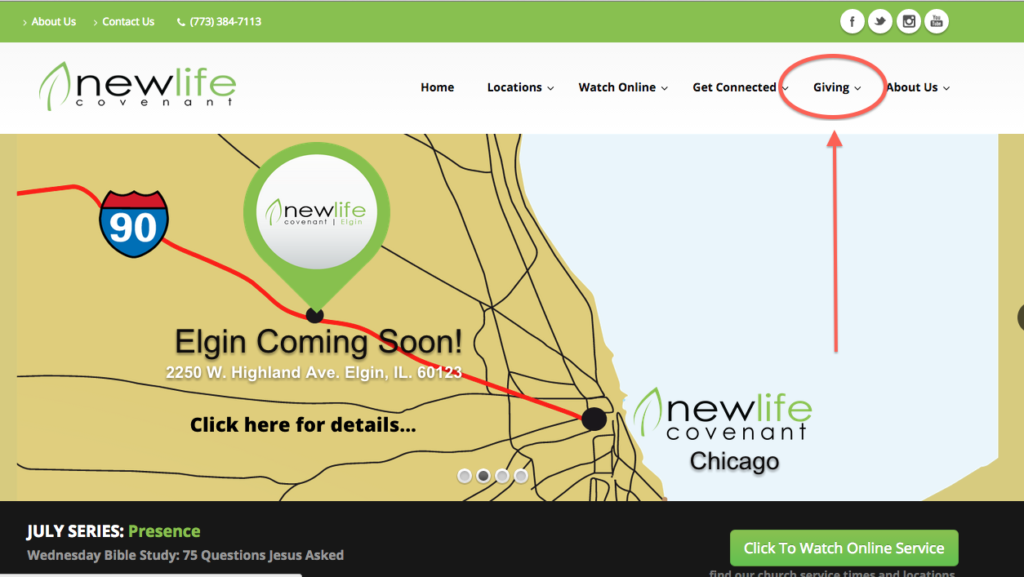
2 – Include The Option To Give As One Of The Primary Pages On Your Website’s Navigation.
The navigation area is one of the few things that will appear throughout the entire website no matter how big or small your church’s site is. The navigation also happens to include the links that get clicked the most as visitors use it to get around your website.

Unfortunately, many churches depend solely on placing an image, link or icon leading to their giving page on the homepage alone, however, when visitors go to other pages, the option is nowhere in sight. That’s why the navigation option is critical; it’s on all (or most) of your pages throughout the entire website.
3 – Let Your Visitors Know They’re Making A Difference Through Their Giving
There are many reasons why people don’t give to churches. Some have had bad experiences with leaders in the past who’ve misused church funds. Some feel they can’t afford to give. And still others don’t give because they don’t think their gift will make a difference.
Knowing these realities, it’s important to help people overcome these obstacles by showing them exactly where their money goes and how their donation impacts lives.

We added verbiage to the giving page which helps givers understand that they are making a difference no matter how much they give. Seeing what the church will accomplish through their donation makes the giver feel like they’re part of something bigger than themselves.
4 – Empower Visitors And Members To Give While Streaming Your Services
Now more than ever, it’s easy to provide an online streaming option for those who aren’t able to attend your service live.
Having an online giving form right on your streaming page allows viewers to remain fully engaged when you share the opportunity to give during service. Think about it. During the service on Sunday morning, you don’t ask people to go out to the foyer to give and then come back in. You shouldn’t be doing that online either!
Why not give them the option to give from your streaming page so they don’t miss a beat?

Make it easy. Make it immediate. Take away any hurdles that may exist between your givers and a gift to your church – whether they’re with you in person or watching online!
5 – Provide The Option To Schedule Recurring Gifts
What would happen if you started each month knowing that a certain amount of gifts would already be coming in that month? Think of the relief and additional ministry opportunities this could provide!
From your visitors or members’ perspective, providing a recurring giving options makes giving more convenient and also removes the guilt for those who didn’t bring their checkbook or cash, but had their heart set on faithful giving.
While recurring giving may not be for everyone, it’s a lifesaver for those who have already made a habit of online bill paying, paperless billing and using technology to simplify their financial management. In fact, this part of your church population may not even own checkbooks anymore.
Now you see why making this option available increases online giving. It caters to those who may not give otherwise (and for the percentage of your congregation who desires to give but just plain forgets).
There you have it.
While there are many other tweaks you can make to your church’s website to gain visibility and engagement, these 5 changes will help you increase your online giving.
As you can see, some tweaks can be done within minutes and others may require the right giving tools to implement. Thankfully, Mogiv provides these features and many more to help your ministry grow your giving and engage more of your members around this important subject of generosity.
—————————————————————————————————————————-
Alex Navas is a digital marketing consultant and coach focused on helping mission-driven businesses and organizations increase their visibility, engagement and impact. He often consults with churches, ministries and nonprofits on how to effectively use the internet to expand their audience and get their message to the masses. Alex can be reached for interviews, speaking and consulting at www.AlexNavas.com or at info@alexnavas.com.

